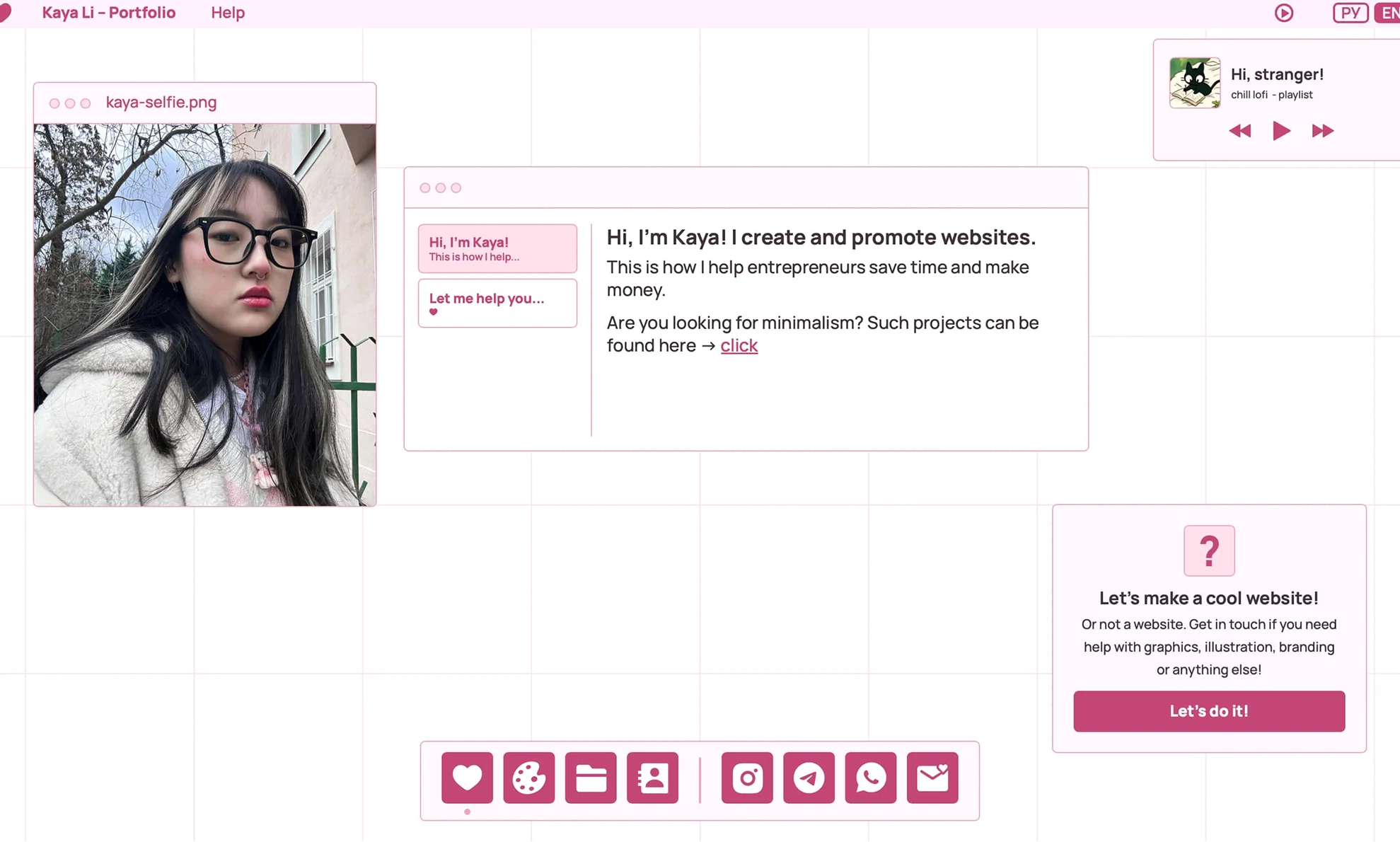
main screen
/website
june 2025
A personal website to showcase my work and skills in a playful, interactive way
Role: designer, developer, illustrator

main screen
/project_story
The project was born out of necessity, not inspiration. Despite having worked in web design for years, I kept putting off creating my own portfolio. I'd tried before, but the old concept never clicked. I couldn’t bring it to life, so I abandoned the idea.
Then, this year, things shifted. I decided I needed to move forward and, moreover, I really spelled out my idea of applying to Falmouth, but I needed a lot of money to do so. I had no choice but to finally create my website. Initially, I wanted to create two versions: one minimal and one creative. However, as I worked, the site naturally evolved into something playful, bold and full of my personal quirks. I didn't want a minimalist version anymore. Now, this website feels exactly like me, and I like it!
/process
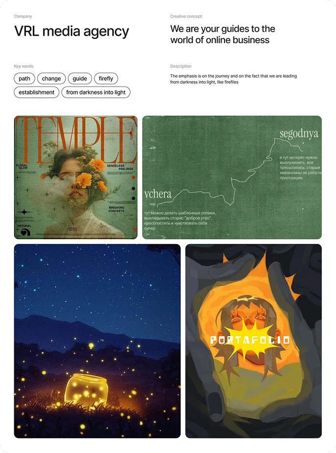
1. Old concept: The first attempt began with the poetic metaphor of guiding others like a firefly, but it never clicked
I first attempted to create my own portfolio website in the summer of 2024 (or rather, I wanted to create an agency and a website for it). I read the book "StoryBrand" and decided to try to promote myself using their approach. I wanted to emphasise that I am a guide, so I came up with a metaphor involving a firefly. The idea was that I would lead people out of darkness and into the light, thereby helping businesses. I gave this idea some thought for a while, but eventually decided to abandon the project
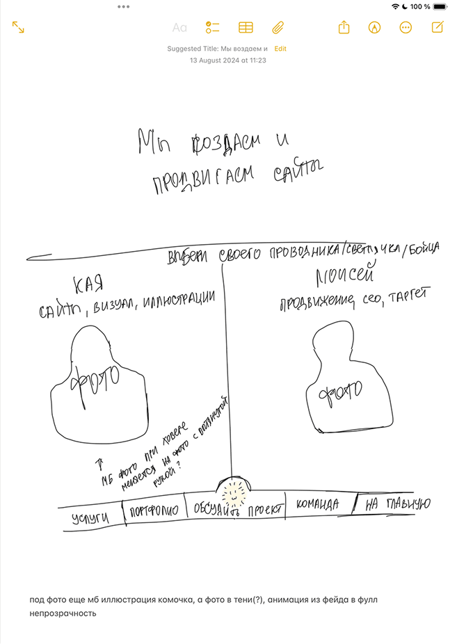
a very rough sketch in the Notes app
my concept and moodboard
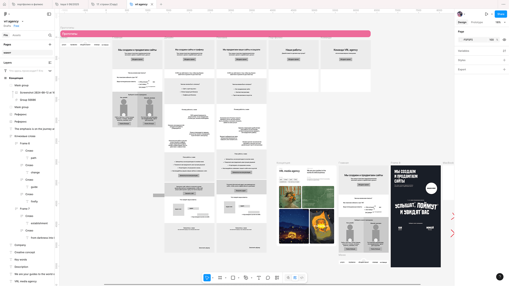
here's a screenshot from Figma: these are the prototype sketches and the only attempt I didn't delete
2. Second attempt: Out of necessity, I returned to the project and explored new directions, ranging from minimalist pages to nostalgic interfaces
As I mentioned earlier, I could no longer put it off this summer. I considered creating two pages: one in my favourite collage style, and the other in a more minimalist style. I started with the first one. However, my favourite collage style involves paper scraps and handwritten fonts, but that's not me. I really like this style, but I'm fully "digital" girl, so after thinking about it for a long time, I decided to create a website in the Webcore style. However, Webcore is associated with old Windows, and I use Apple products, so I decided to try the old MacOS vibe instead. However, I quickly changed my mind as I had never used it before. I had only ever used new versions, so I decided to design for modern MacOS, but rework it slightly, as they have a very strict licence and the project is commercial after all
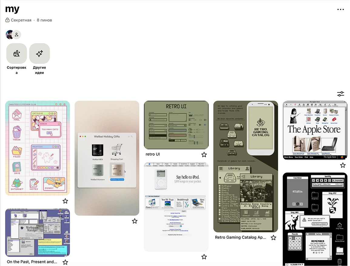
my first moodboard for this project
My new references were my iMac, Apple's UI kit, a few images in a similar style and a website I found in my inspiration folder
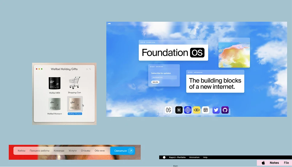
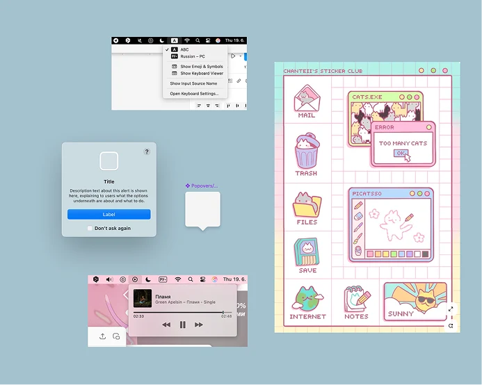
my new references
After that, I tried to create a digital collage that reflected me and my messy approach. In life, my style is a mix of punk-goth and pink anime. Since I usually dress in black, I decided to stick with that. However, this seemed too strict and minimalist. So what was the point of making two separate pages? After sitting there for a long time twisting and turning, I finally decided to start over. However, something inside me suggested that I try doing everything in pink first, since my iMac, desktop wallpaper and even my cursor are all pink. Black wouldn't reflect me completely, of course
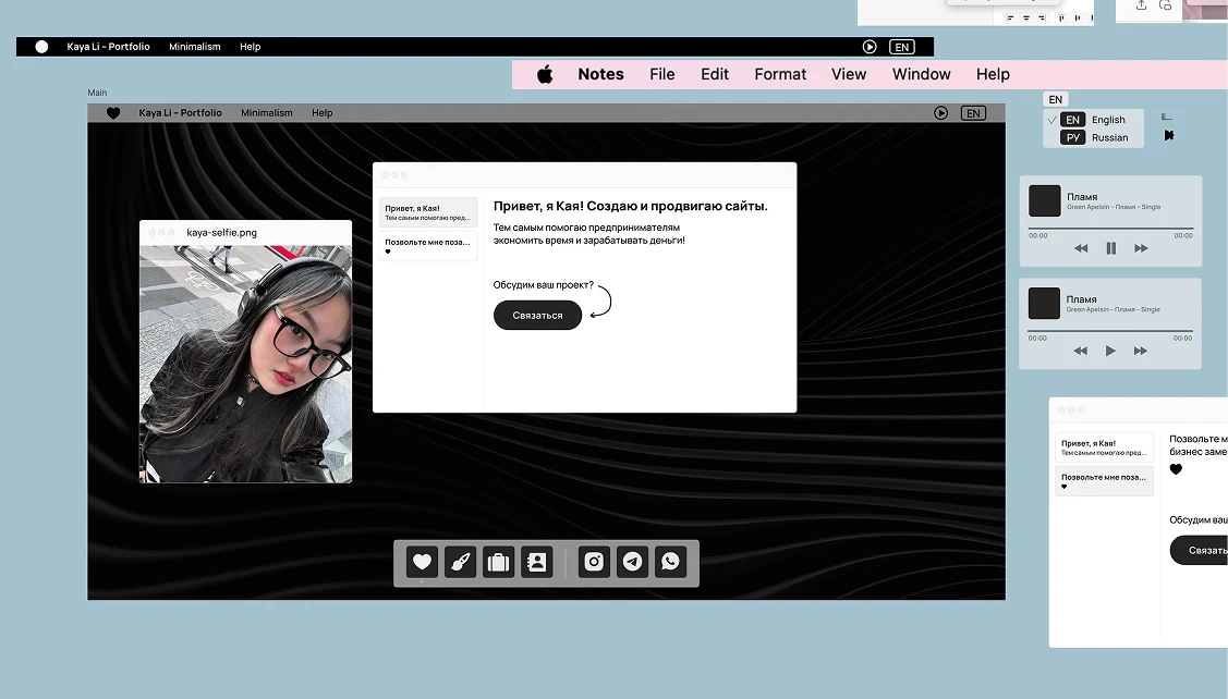
black version
3. It clicked: After a period of uncertainty, everything suddenly fell into place, and the site finally felt like me
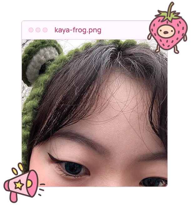
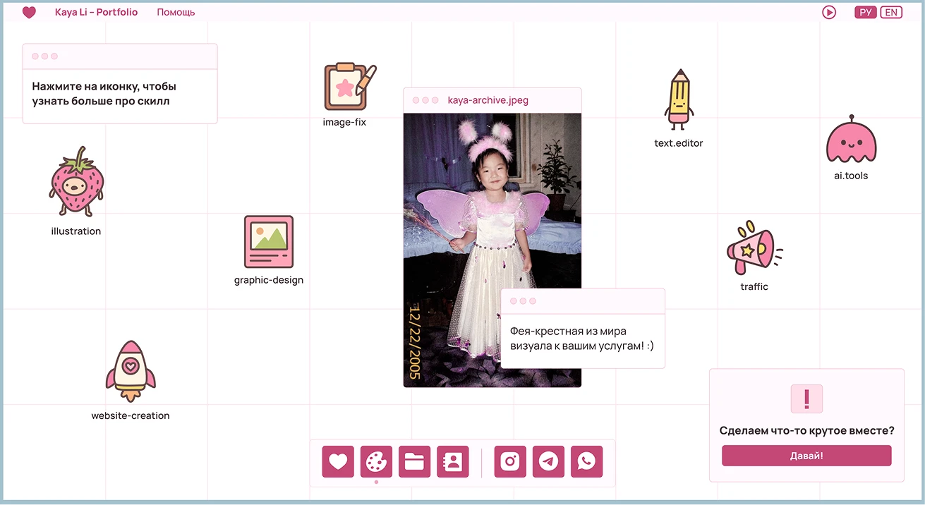
And then it clicked. All four pages were created on inspiration. Everything flowed naturally. For the second page, I first created rough sketches in Procreate, which I then drew as vector images using a pen in Figma. As I didn't have any decent studio photos, I decided to dig through my phone. I thought it would be fun to add a childhood photo of myself and came up with a new metaphor involving a fairy godmother. For the third page, I chose projects divided into three categories: minimalist, creative, and concepts. The design finally reflected who I am
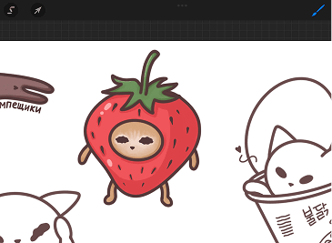
this guy I drew a long time ago
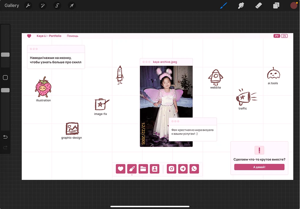
Procreate: very rough sketches
the result
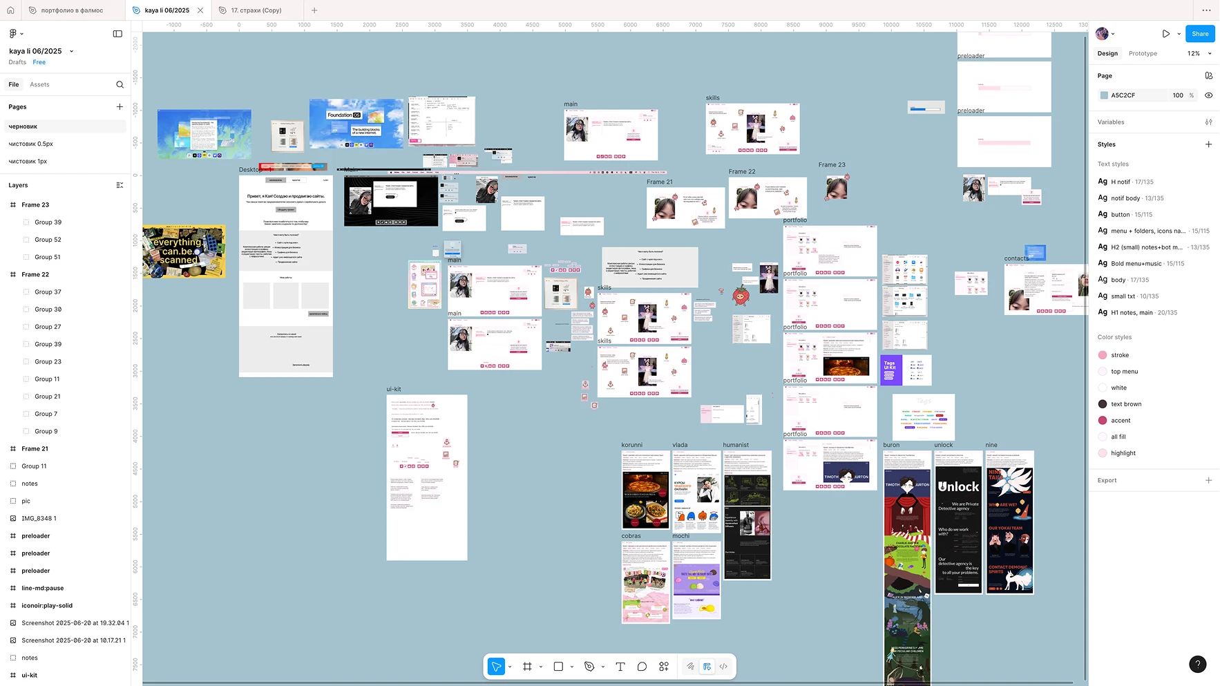
a screenshot from Figma: my draft
4. Final development
I had previously only worked on Tilda, but I had wanted to learn Webflow for a long time. This project provided the perfect opportunity for me to do so. To be honest, I found it very challenging at first. Everything felt unfamiliar, and I couldn't implement many of my ideas without code. Ultimately, though, I ended up with a fully functional website featuring a creative design and layout
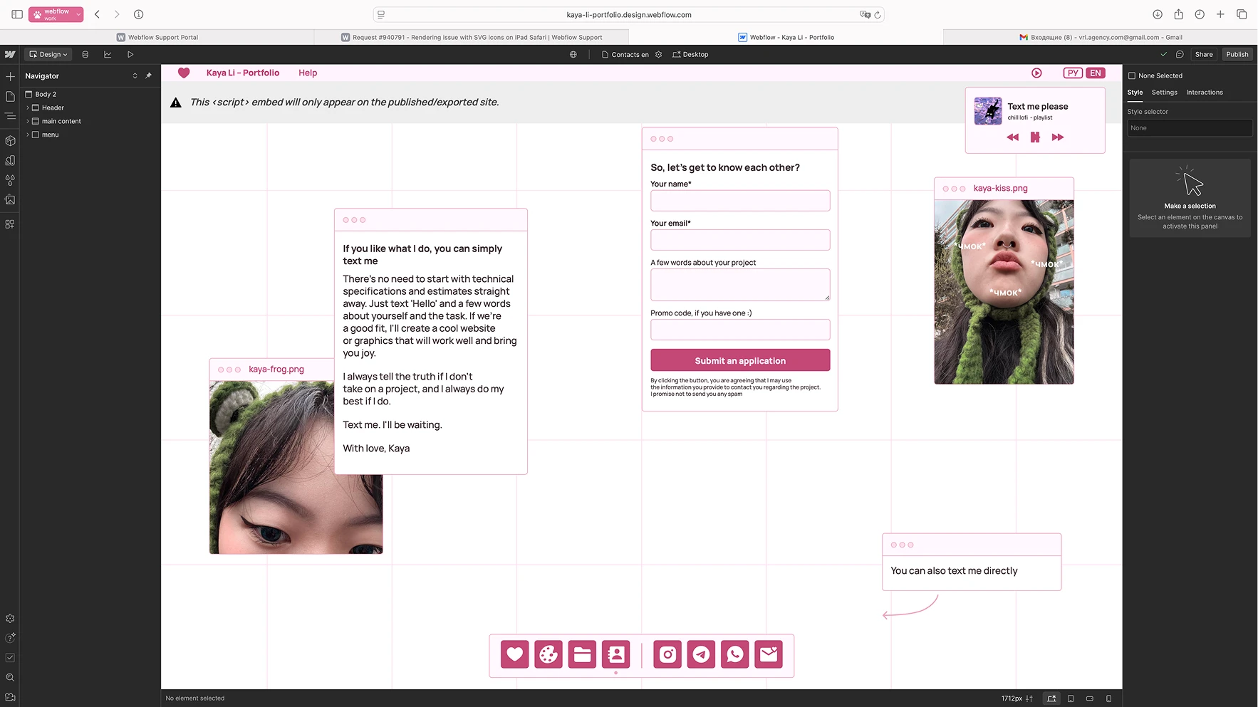
a screenshot from Webflow: contact page
/final_result
You can see it yourself by clicking the button. Alternatively, here is my screen recording
desktop version
mobile version
/reflection
This project helped me to recover from my recent burnout. It was like a breath of fresh air; it allowed me to experiment, learn new things, which I love to do, and engage in pure creativity
/next?